DQG Blog
Theater Branding in the Digital Age - PART 1
Welcome to Part 1 of our 9-part series on Theater Branding!
This series is for anyone who wants their production’s graphics to look as sharp and fresh as their production. And plus, the series is kind of fun too!
Theater Branding in the Digital Age TEASER
Our rules for branding your theater are at the heart of our upcoming blog series. We'll also examine what branding is, why theaters need it, what works, what doesn’t, and suggest how to maximize your budget to make your marketing look as good as your productions.
Starting in September. You won't wanna miss it!
Publicizing the dickens out of your Charles Dickens.
Charles Dickens has no idea what he’s created. This holiday season, in the United States alone, dozens of stage adaptations of A Christmas Carol will be performed across hundreds of venues.
Licensed to Design!
Drama Queen has been hard at work designing the graphics for Stage Right's individual shows.
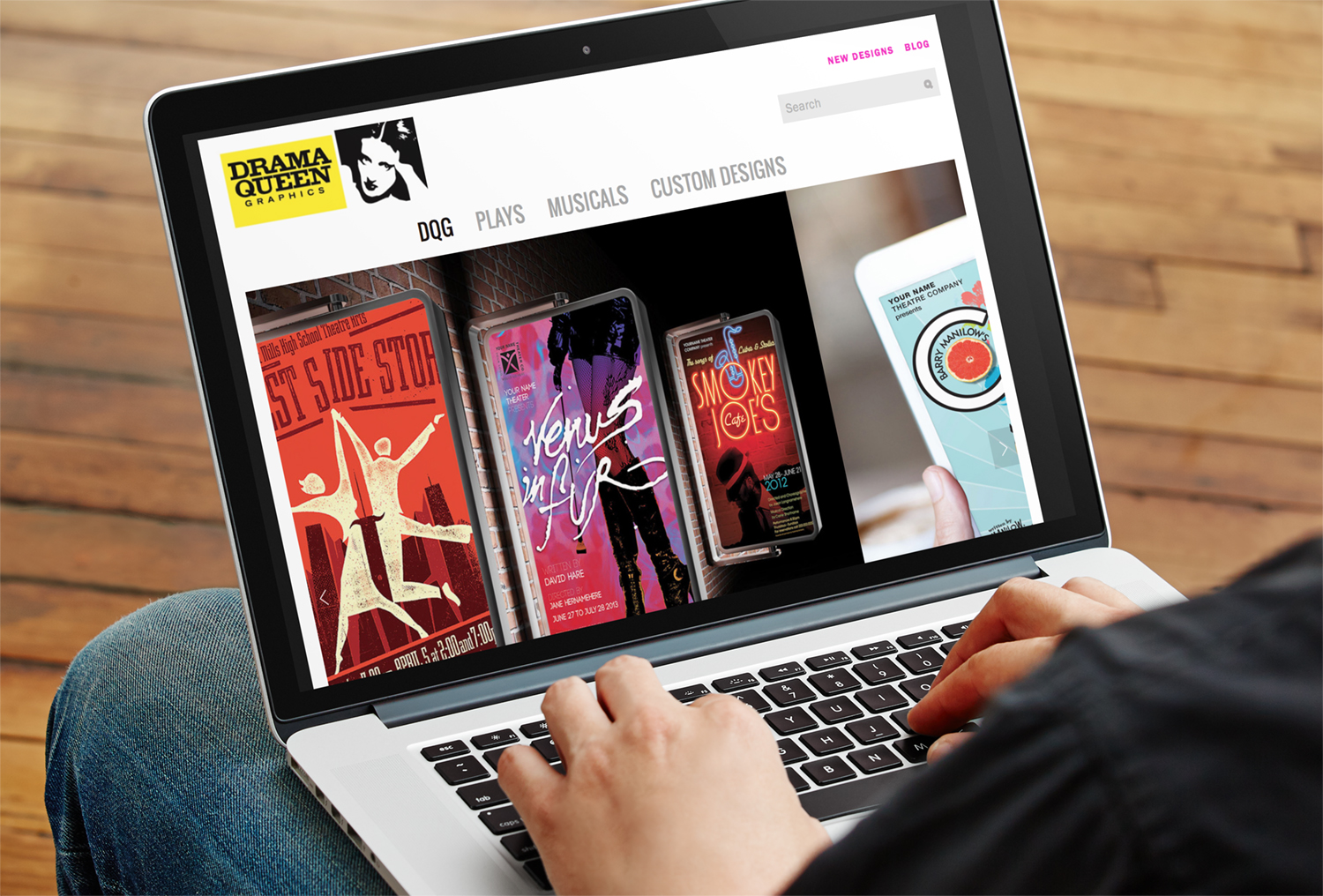
Drama Queen’s New Website!!!
Our new responsive website design makes it easy to visualize how your design will look on anything from a tee shirt to a marquee.
No Logo? No Worries.
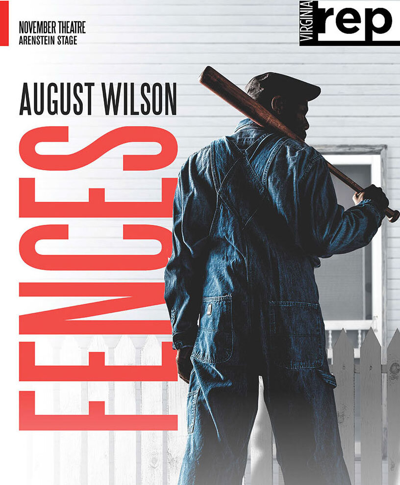
Dignity's publicity materials represent an alternative way to build a visual identity that communicates who you are and what makes you unique...even if you don't have an awesome logo.
Hug Your Bat Boy
I heart Bat Boy: The Musical. I saw it Off-Broadway many moons ago and found it absolutely delightful. It’s campy, scary, irreverent, wonderfully melodic and just plain fun. It’s like Ru Paul’s Drag Race with fangs, less glitter and no tucking.
Stage Rights’ New Brand
We were invited to help Steele Spring Theatrical Licensing & Royalties re-brand themselves as Steele Spring Stage Rights.
Is a Poster Right for YOUR Show? Part 2
Reviews and word-of-mouth matter, but a patron’s decision is also influenced by what he/she sees: posters, signs, newspaper ads, brochures, and web site. With theaters competing harder than ever for audiences, you need to stand out.
Is a Poster Right for YOUR Show? Part 1
So, Mister Potential Audience Man is standing in Starbucks, waiting for his soy latte, and sees your poster in the window. If the poster is visually arresting, he thinks to himself: “Hmmm…I wonder what that is?” Contact is made. Step 1 is accomplished. It’s time to move on to…
Right Show. Wrong Audience.
You’re producing Love Valour Compassion complete with naked bodies and a little onstage whoopee, and who is seated in the front row of the first Sunday matinee? A nice group of church-going ladies. They have no idea what they are in for. It’s Easter-time and they think they're about to see the sequel to The Greatest Story Ever Told. They’re totally psyched.
Design Awards
Drama Queen Graphics is thrilled to have won two 2013 Design Awards for Graphics at AACTFest, the association’s national conference in Indianapolis.
I Want Your WGSEX
To mark my ten year anniversary, the college is producing an exhibition of my work. This is an incredible honor and I’d like to thank the voters, my agent, Harvey Weinstein and Lena Dunham.
Confessions of a Design Diva: “Picnic”
William Inge’s 1953 classic Picnic, is about more than a hot man without a shirt, but the viewing public doesn’t really care.
Confessions of a Design Diva: “The Pillowman”
Written in 2003, this play centers on a writer who creates gruesome stories featuring the violent deaths of children. Think the Brothers Grimm on acid.
Confessions of a Design Diva: “The Price”
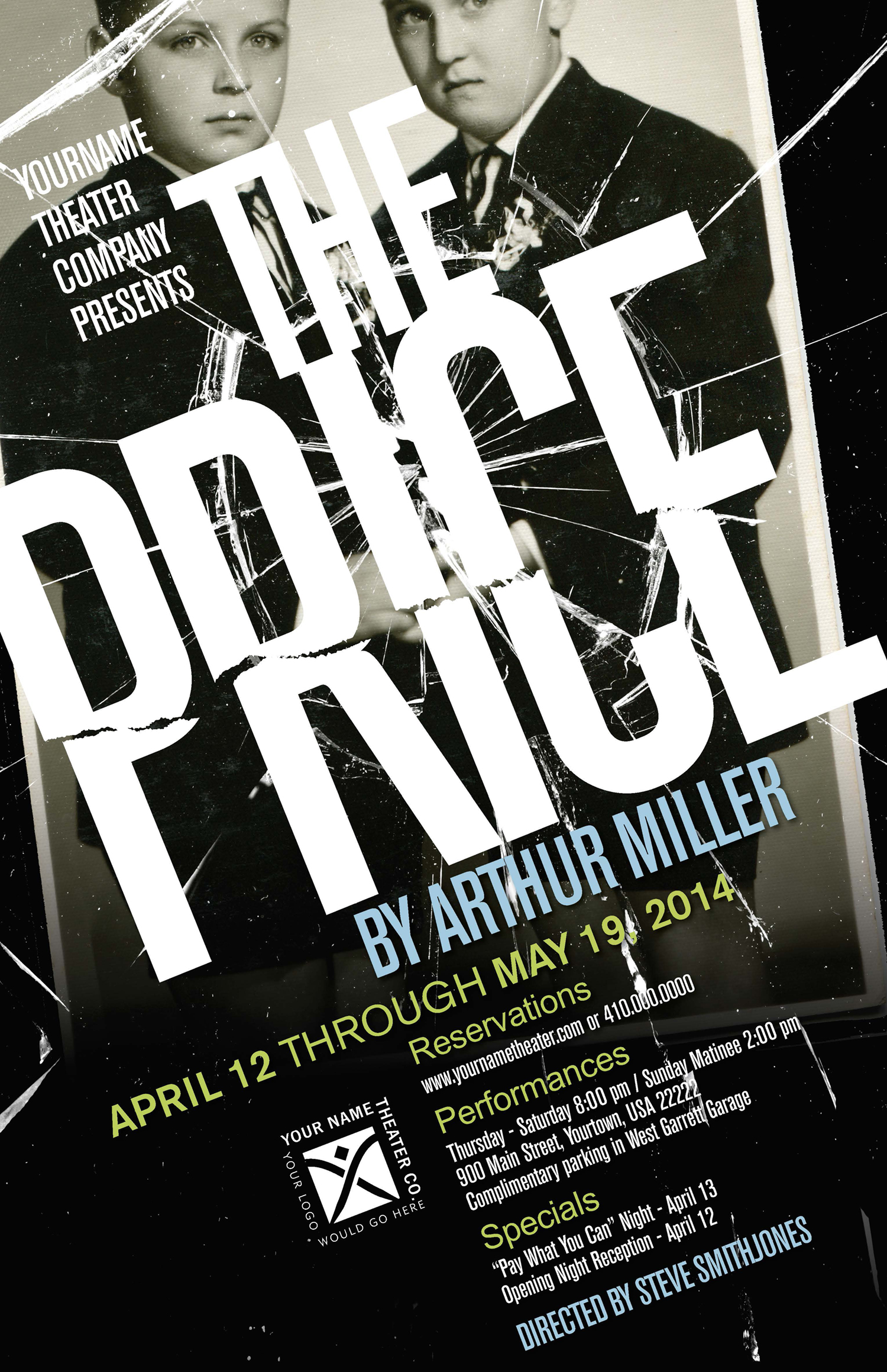
Our poster design features a childhood portrait of the two brothers set in a broken frame. The image represents their past while the shattered glass alludes to the current conflict between the characters.
Confessions of a Design Diva: “Prelude to a KIss”
If you’re familiar with the show (which revolves around the magical transformation of Peter’s wife Rita into an old man), you know that in one pivotal scene Peter kisses the old man in order to regain his youthful (and female) wife. And so the frog literally symbolizes the old man.


