DQG Blog
Is a Poster Right for YOUR Show? Part 1
So, Mister Potential Audience Man is standing in Starbucks, waiting for his soy latte, and sees your poster in the window. If the poster is visually arresting, he thinks to himself: “Hmmm…I wonder what that is?” Contact is made. Step 1 is accomplished. It’s time to move on to…
Right Show. Wrong Audience.
You’re producing Love Valour Compassion complete with naked bodies and a little onstage whoopee, and who is seated in the front row of the first Sunday matinee? A nice group of church-going ladies. They have no idea what they are in for. It’s Easter-time and they think they're about to see the sequel to The Greatest Story Ever Told. They’re totally psyched.
Design Awards
Drama Queen Graphics is thrilled to have won two 2013 Design Awards for Graphics at AACTFest, the association’s national conference in Indianapolis.
Confessions of a Design Diva: “The Pillowman”
Written in 2003, this play centers on a writer who creates gruesome stories featuring the violent deaths of children. Think the Brothers Grimm on acid.
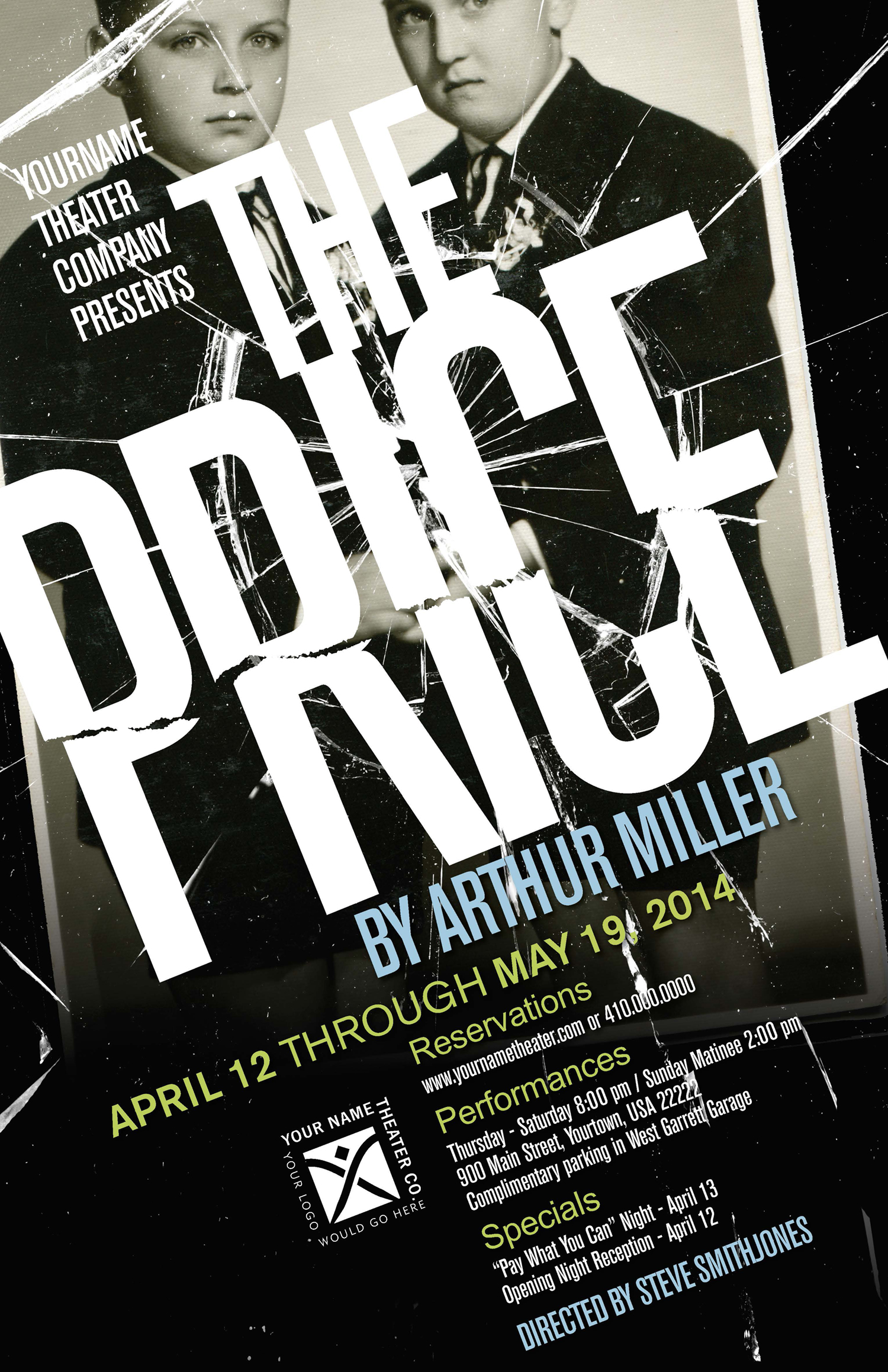
Confessions of a Design Diva: “The Price”
Our poster design features a childhood portrait of the two brothers set in a broken frame. The image represents their past while the shattered glass alludes to the current conflict between the characters.
Confessions of a Design Diva: “Prelude to a KIss”
If you’re familiar with the show (which revolves around the magical transformation of Peter’s wife Rita into an old man), you know that in one pivotal scene Peter kisses the old man in order to regain his youthful (and female) wife. And so the frog literally symbolizes the old man.


